Amsteldok
Amsteldok
A leading communications company decided to bring together 15 Dutch agencies into one ‘Campus’ designed to provide a world-class space that brings together its people and agencies in one location, encouraging greater collaboration and easier access to talent and expertise. Superunion was asked to develop a name, brand identity, attitude and tone of voice for the new Amsterdam Campus. Amsteldok is a living entity, breathing creativity and collaboration.
Awards

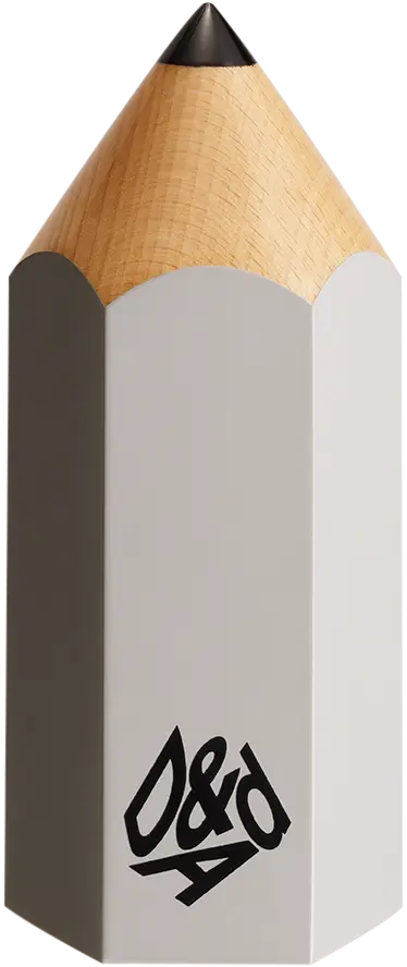
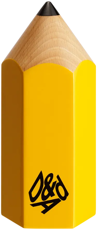
D&AD Pencils
Credited Pencil winners... you kept creativity alive. Now take home the proof.
Details
- Categories
- Countries
- Year
Credits
- Client
What did the judges have to say?