;
We Compost — Feed the Worms
We Compost — Feed the Worms
We Compost is Auckland’s leading compost service, diverting millions of kg from going to landfill. But after seven years of operation, its brand positioning and visual identity didn’t align with the incredible work it was doing. Given the huge positive impact composting has, We Compost wanted to appeal to everyone, not just eco-warriors. This solution celebrates the mighty worm (worms play a crucial role in composting). Seachange developed an iconic logo, bespoke typeface and bold graphic worm print for maximum standout. Every touchpoint was an opportunity to engage in a fun and memorable manner.
Awards
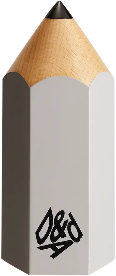

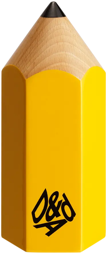
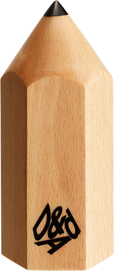
D&AD Pencils
Credited Pencil winners... you kept creativity alive. Now take home the proof.
Details
- Categories
- Countries
- Year
Credits
- Client
;
What did the judges have to say?