Natura Ryos
Natura Ryos
The Amazon isn’t just a place—it’s a force, an intricate balance of nature and culture, held together by the rhythm of its rivers. Ekos Ryos was born from the desire to bottle that rhythm, creating packaging that doesn’t just hold fragrance, but carries the spirit of the forest itself. At the core of the design is water, represented by the letter “Y” in Tupi language. This became the heart of the identity—a fluid, living typography that mimics the movement of rivers and extends into both packaging and visual language.
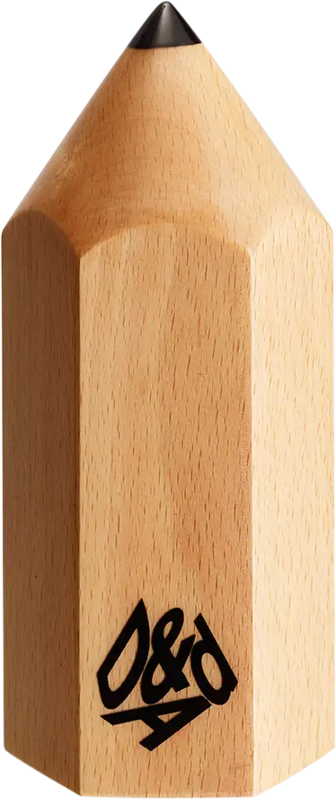
D&AD pencils
Details
- Categories
- Countries
- Year
Credits
- Entrant Company
- Brand
- Ekos Ryos
- Design Agency
- Production Company
- Gazpacho
- Client

