;
Helan
Helan
Centered on the rock formations of the HeLAN Mountains and the Chinese phonetic core of "HeLAN": Reconstruct artistic typography through mountain silhouettes, infusing the undulating ridgelines into the letterforms of "HeLAN." The lowercase "e" not only enhances phonetic clarity but also serves as a metaphorical nod to the Yellow River's nourishing presence. Extending this mountain-inspired typographic system into branding applications visually amplifies the Eastern ethos of "mountain spirit infused into wine," while establishing an aesthetic icon for Chinese wine.
Awards

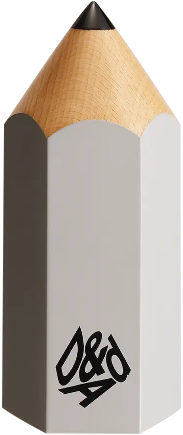
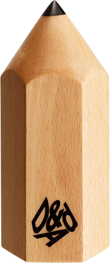
D&AD Pencils
Credited Pencil winners... you kept creativity alive. Now take home the proof.
Details
- Categories
- Countries
- Year
Credits
- Entrant Company
- Blackbow
- Brand
- Helan
- Advertising Agency
- Blackbow
- Design Agency
- Blackbow
- Production Company
- Blackbow
- Client
- Helan Mountain Wine Management Committee
;