;
Bulldog Broadband

Bulldog Broadband
The bulldog logo attempts to make a hard word warmer, charming and witty to reflect the bulldog brand values: simplicity, strength, economical and approachable. These merits help the brand to be distinctive and stand out in a messy and cluttered world of broadband providers. It is an intentional throwback to the traditional logotype design, and is only ever shown in black and white to reinforce its roots. Typographically, it marries two different fonts together. The 'bulldo' and the 'g' are separate typefaces; the 'bulldo' has been slightly tweaked and crafted for a softer and more finished result, and by repeating the ear on the 'g', the idea of a dogs ears is represented.
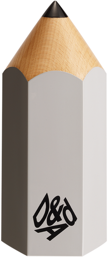
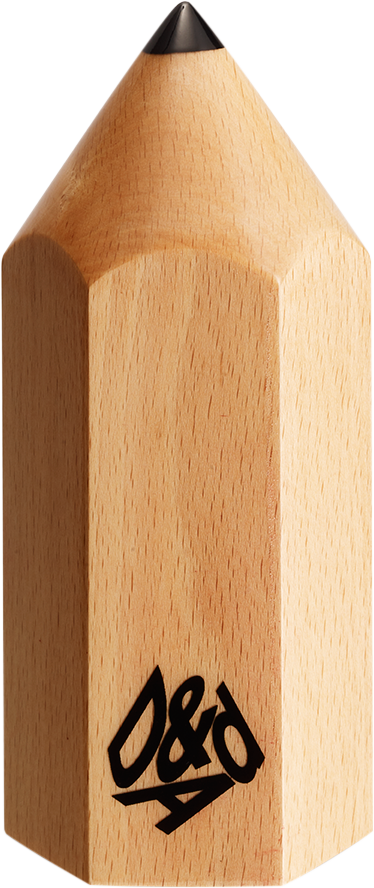
D&AD pencils
Details
- Categories
- Countries
- Year
Credits
- Client
- Cable & Wireless
;