;
ADC Re-branding
ADC Re-branding
We developed a simple symbol that places the ADC acronym in a circle. To keep ADC's heritage, we brought back visual cues from the original logo and adapted them to the new branding. The renewed logo was a good start, but we needed a playful system that would communicate the craft. By taking squares and circles from the symbol's original shape, we were able to create an extended version of the logo, in which multiple lines and patterns can be randomly added. To complete the rebranding, we traced a custom font that would complement the symbol.
Awards
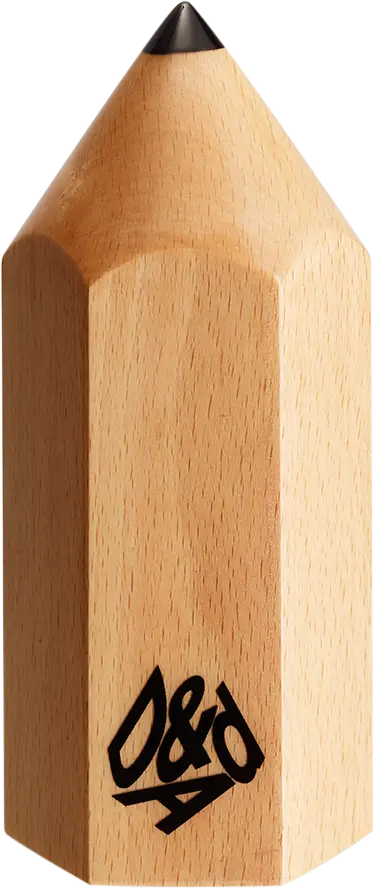

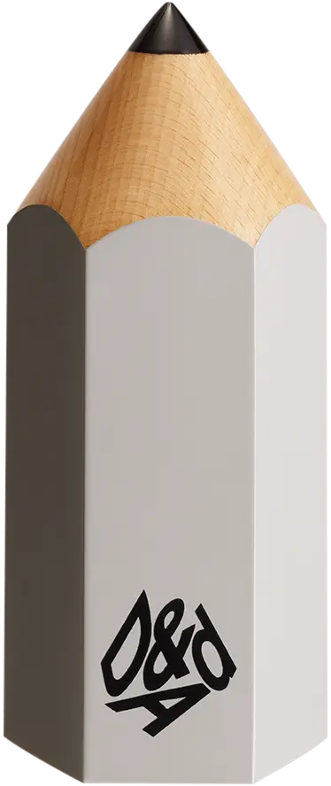
D&AD Pencils
Credited Pencil winners... you kept creativity alive. Now take home the proof.
Details
- Categories
- Countries
- Year
Credits
- Client
- Art Directors Club
;